
DTF color management is the backbone of delivering consistent, vibrant transfers across a range of fabrics. For suppliers and printers alike, color control is not a luxury—it’s a necessity that directly impacts client satisfaction, repeat business, and the perceived value of your DTF products, especially when you excel at DTF transfer color matching. This guide discusses how to achieve reliable color alignment across designs and fabrics, and how practical calibration steps bind your digital intent to the final print. Whether you are just starting with DTF color management or looking to refine an established process, these insights will help you deliver consistent results that stand out in the marketplace. By applying deliberate testing, profile management, and disciplined workflow, you can build trust with clients and reduce color surprises across batches.
In practical terms, this topic translates to dependable color consistency across devices, substrates, and lighting conditions. Think of it as color fidelity from screen to fabric, where profiles, soft proofs, and repeatable print workflows keep hues true as garments vary. An ICC-driven approach that catalogs substrate responses and underbase decisions helps minimize guesswork and deliver predictable results. With a structured calibration mindset, teams can scale their operations—from one-off jobs to larger runs—without sacrificing accuracy.
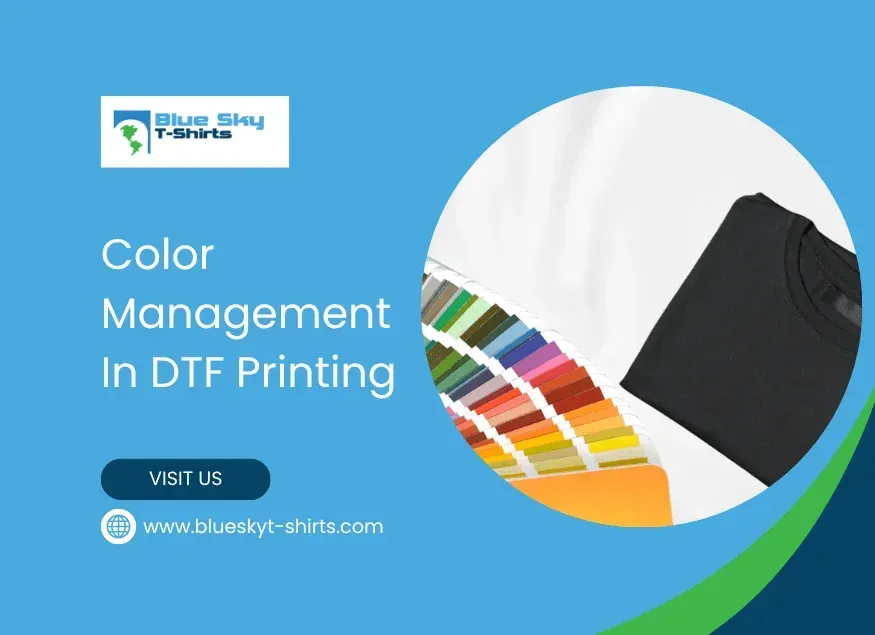
DTF Color Management: Foundation for Consistent Transfers Across Fabrics
DTF Color Management is the backbone of delivering consistent, vibrant transfers across a range of fabrics. This approach ensures that what you design on screen translates to the final print with fidelity across white cotton, black blends, heathers, and synthetics. When implemented well, DTF color management improves color accuracy in DTF, reduces rework, and boosts client confidence in your ability to reproduce brand colors, which can translate into repeat business and higher perceived value of your DTF products.
Color management is not a one-step task but a system built on display calibration, print calibration, and garment calibration. Display calibration ensures your design colors reflect accurately on screen; print calibration aligns printer output with the ICC profile and transfer film; garment calibration accounts for how ink appears on different fabrics after heat and pressure. Together, these stages drive color accuracy in DTF and reproducibility across runs and garment colors, so what you see is what you get no matter the substrate.
DTF Transfer Color Matching: Aligning Design Intent with Garment Outcomes
DTF Transfer Color Matching is about translating a designer’s color intent into screens and then into fabrics, ensuring the final transfer matches expectations across white, black, and colored garments. This process requires measuring shifts that occur due to fabric base color, ink interaction, and film behavior, and setting targets that keep hues stable in real production.
Practical steps include calibrating displays with hardware tools, loading substrate-specific ICC profiles, soft-proofing designs, and running representative test prints. By documenting observed deviations in hue, brightness, and saturation, you can tighten color control and reduce guesswork during production, supporting consistent color accuracy in DTF across jobs.
DTF Printing Color Calibration: From Design Space to Fabric Reality
DTF Printing Color Calibration focuses on aligning the digital design with the printed result through printer, film, and ink adjustments. Start by applying or creating ICC profiles that reflect your film, ink set, and transfer process, then calibrate the printer to match those standards. The goal is to minimize color drift between what appears on screen and what lands on fabric, supporting vibrant DTF transfers.
After establishing calibration baselines, run test prints on representative fabrics and observe deviations under proper lighting. If you notice shifts toward warmth or coolness, adjust the design colors or printer settings within the profile, and recalibrate curves as needed. Post-press validation is essential—verify that the pressed shirt matches soft-proofs and reference swatches to confirm color accuracy in DTF.
Strategies for Achieving Vibrant DTF Transfers Across Fabrics
Strategies for Achieving Vibrant DTF Transfers Across Fabrics emphasize color brightness, saturation, and consistency from white to dark fabrics. A vibrant transfer starts with a solid color foundation, including a suitable underbase, color profile selection, and careful ink-film interactions that preserve hue after heat.
Pair this with reliable supplies—high-quality inks and powders, a stable transfer film, and a consistent base substrate—and you’ll experience fewer color surprises across substrates. Regular testing across a fabric range and a documented set of color targets help you reproduce vibrant DTF transfers for every job.
Color Accuracy in DTF: Fabric-Specific Calibration and Underbase Tactics
Color Accuracy in DTF comes into sharp relief when you calibrate per fabric type and manage underbase decisions. White underbase opacity and color choices directly influence the measured hue and brightness of the final transfer, especially on dark or colored fabrics. A fabric-specific calibration routine helps keep color shifts predictable and manageable across garment families.
Maintain a growing library of color profiles for common fabrics and garment colors so you can rapidly select the right profile for a job. Documented tests and profile adjustments create a traceable path to consistent color accuracy in DTF and deliver the vibrant transfers customers expect.
Workflow and Troubleshooting: Maintaining Consistent DTF Color Over Time
Workflow and Troubleshooting: Maintaining Consistent DTF Color Over Time covers how to preserve color targets from first print to last. Even with a strong system, issues like drift, batch variation, or substrate color shifts can creep in, so proactive checks are essential.
Best practices include scheduling regular equipment maintenance, keeping a color library with ICC profiles, using standardized proofing lighting, performing periodic audits against reference prints, and training staff to follow the established color workflow. With disciplined oversight, you can sustain color accuracy in DTF and deliver consistent, vibrant transfers across every run.
Frequently Asked Questions
What is DTF color management and why is it essential for color accuracy in DTF transfers?
DTF color management is the coordinated set of processes that ensures colors stay consistent from your digital design to the final print on fabric. It starts with display calibration, print calibration, and garment calibration to achieve color accuracy in DTF and ultimately vibrant DTF transfers. When done well, what you see on screen matches what you print on white, black, or colored fabrics.
How does DTF transfer color matching improve consistency across garments and fabrics?
DTF transfer color matching uses a repeatable workflow to reduce guesswork and deliver consistent results across diverse fabrics. By using ICC profiles tailored to each substrate, soft-proofing designs, and representative test prints, you can maintain color accuracy in DTF and achieve reliable vibrancy on white, black, and colored garments.
What steps are involved in DTF printing color calibration to achieve vibrant DTF transfers?
Key steps include: calibrating your display with a standard color profile; creating or loading ICC profiles for your printer, film, and ink set; soft-proofing to simulate results; running test prints on representative fabrics; adjusting design colors or printer settings within the profile; and validating post-press color against reference proofs. Following this DTF printing color calibration process helps reduce variability and delivers vibrant DTF transfers.
How do different fabrics affect color accuracy in DTF and how can I manage it?
Fabric type drives color shifts in DTF; a robust DTF color management plan uses fabric-specific calibration. Calibrate for white/light fabrics with standard underbase; for dark fabrics adjust underbase opacity to preserve brightness; for colored fabrics factor substrate color into the color profile. Build a library of color profiles for common fabrics to maintain color accuracy in DTF across jobs.
What are common color issues in DTF color management and how can I troubleshoot them?
Typical issues include faded or washed-out colors; color shifts between runs; unwanted color casts from the substrate; and hue/brightness mismatches after press. Troubleshoot by rechecking ICC profiles and printer heat settings, ensuring consistent transfer film and garment quality, re-calibrating if media or ink lots change, and using improved soft-proofing and test prints.
What best practices help sustain color quality in DTF color management over time?
Adopt regular equipment maintenance and calibration checks; maintain an organized color library with profiles for common fabrics and colors; use standardized lighting for proofing; perform periodic audits comparing transfers to reference prints; and educate staff about color management to keep color accuracy in DTF consistent across the team.
| Topic | Key Points |
|---|---|
| Definition | Color management is the coordinated set of processes that ensures colors stay consistent from your digital design to the final print on fabric; goal is color accuracy and reproducibility across runs and garment colors. |
| Core concept | Three linked stages: display calibration, print calibration, and garment calibration; each stage matters for achieving color accuracy in DTF and delivering predictable results. |
| Key supplies | Inks and powders, transfer film, and garment substrates; quality matters. White underbase improves color brightness on dark fabrics. Testing across fabrics helps predict color shifts. |
| Color Matching Workflow |
|
| Fabric Calibration | Fabric differences drive color variability. Calibrate per fabric type: white/light fabrics, dark fabrics (underbase), and colored fabrics. Maintain a library of profiles. |
| Troubleshooting | Common issues: fading colors, color shifts between runs, unwanted casts, hue/brightness mismatches. Fixes include recalibrating ICC profiles, adjusting heat-press settings, and auditing proof-to-print color. |
| Best Practices | Regular maintenance and calibration checks; organized color library with ICC profiles; standardized proofing lighting; periodic audits; educate staff on color management. |
Summary
DTF color management is the foundation of reliable, vibrant transfers across fabrics and substrates. A solid DTF color management approach aligns display calibration, print calibration, and garment calibration to deliver consistent color accuracy from screen to print and across runs. By selecting high-quality inks, powders, transfer films, and substrates, and by following a repeatable color matching workflow—calibrating displays, loading appropriate ICC profiles, soft-proofing, conducting test prints, adjusting design or printer settings, and validating post-press results—printers can reduce variability and build client trust. Regular testing, documentation, and a curated library of color profiles enable scalable color fidelity across different garment colors and fabrics, ensuring that each transfer reflects the intended design. In short, investing in DTF color management elevates product quality, client satisfaction, and marketplace competitiveness.